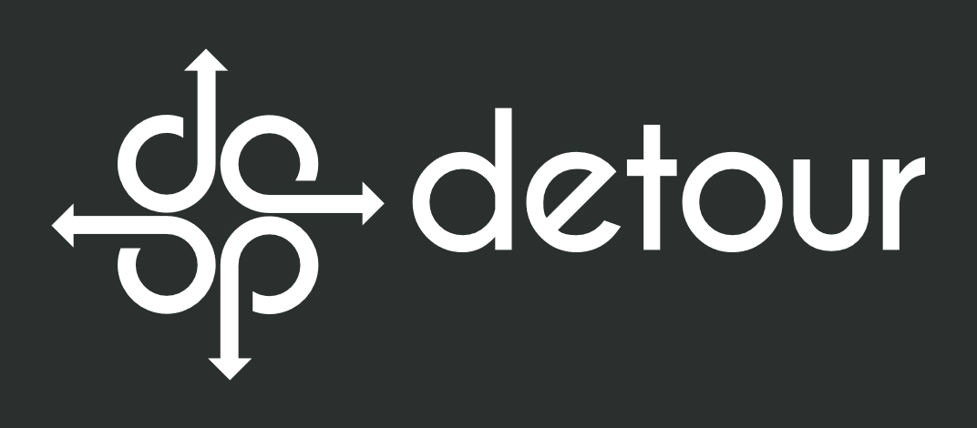
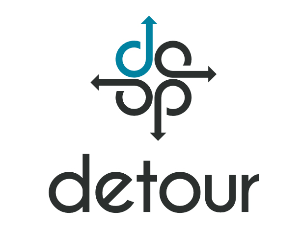
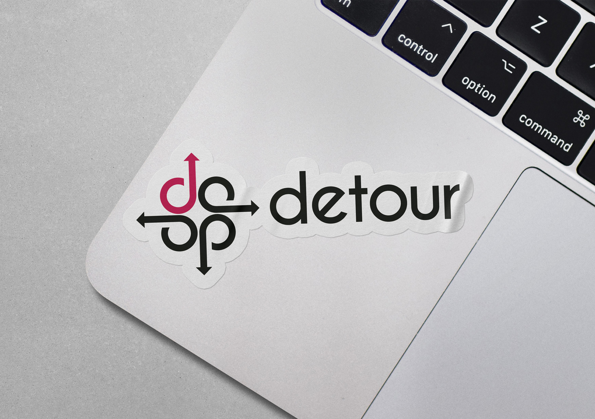
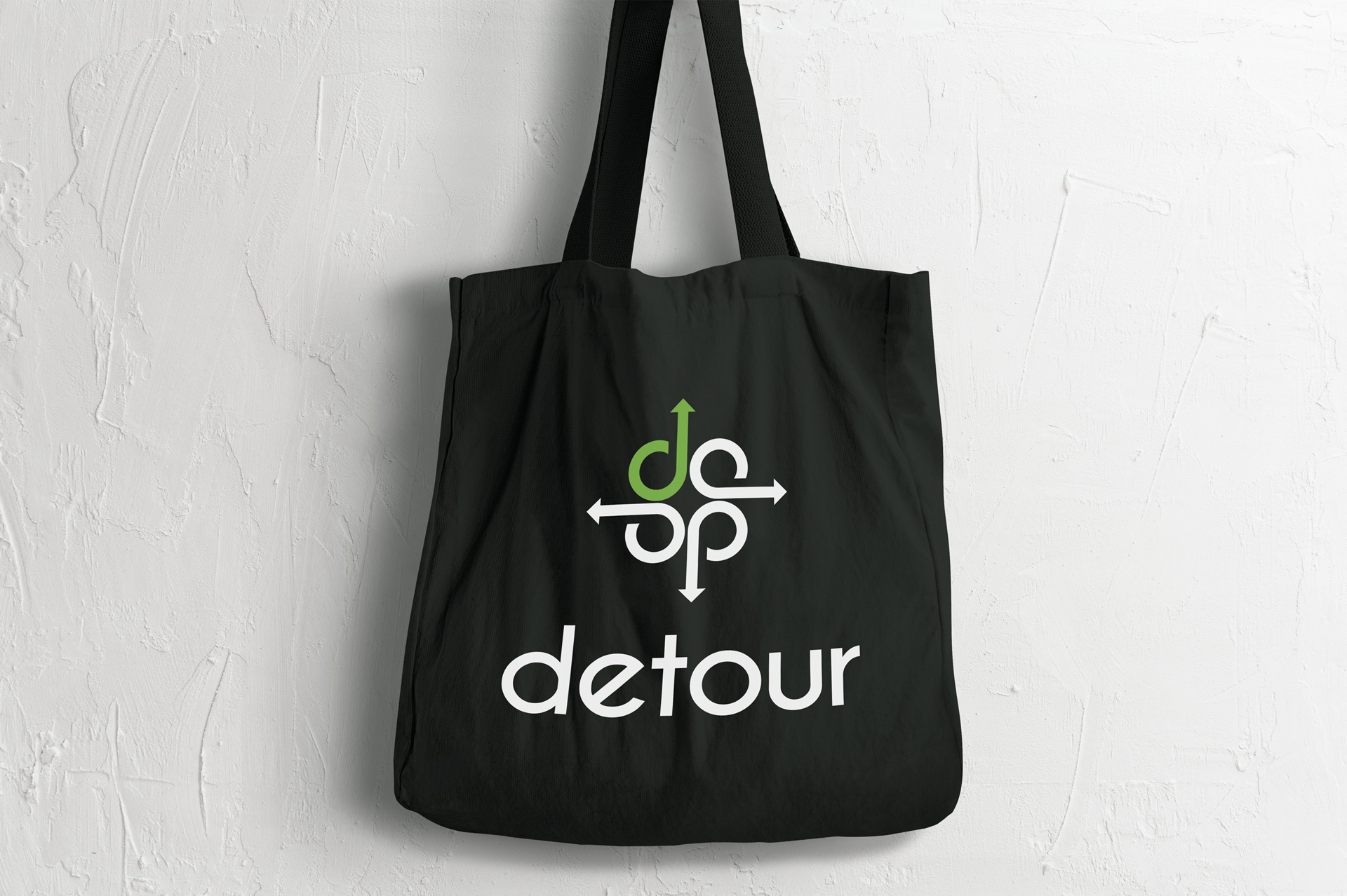
We developed the brand and designed a logo for Detour Quartet. The name and definition of the word detour, a long or roundabout route that is taken to avoid something or to visit somewhere along the way, inspired the logo design. We used the shape of the font’s lowercase “d” to signify the detour roundabout route and incorporated an arrow to signify movement. The lowercase "d" visually looks like a half note. When combined with the arrow, and the three other lowercase "ds", it signifies music by representing four notes in a chord. Each "d" also represents one of the members of the quartet.
We used a classic black to ground the logo, and added a pop of bold color on one of the shapes to represent the detour. The four bold colors represent the four unique, and diverse members of the group and represent the strength and bravery one may need when taking a detour.

Book a free, 30–min consult.
We understand that representing your brand is a big responsibility. Try our 30-min, complimentary consult to discover if we’re a good fit and gain project clarity.


Make this year the year your company thrives.
Sign up to receive marketing tips, advice and trends right to your inbox so you can take your marketing to the next level.
